Badho
Redesign User Profile to enable Deep Profiling & Better Brand Collaboration
Drove 5,764% growth in profile views, 224% in KYC submission and unlocked better brand collaboration for Badho.
User Profile
D2C Brand Collaboration
Badho

Team
Product Designer (me)
Product Lead
Associate Product Manager
1 Frontend Developer
My Role
Product Thinking
UX Design
Research analysis
Stakeholder Management
Wireframing & Hi-Fi Prototyping
Design Testing on Deployment
Duration
2 Weeks ( Product & Design )
Context
Badho connects retailers & distributors in one system
Badho runs two apps. The Buyer App is a B2B ecommerce app used by retailers to buy directly from distributors.
The Seller App is used by distributors to manage products, pricing and orders. This case study covers the Buyer App.
Buyer App
Used by retailers to browse products and place orders


Seller App
Used by distributors to manage products, pricing, and orders


The problem
Users weren't completing their profiles, leaving Badho without the data it needed
Impact on Badho
●
Lack of insights to understand retailer personas & personalized experience
●
Unable to segment users for brand-targeted ads/content
Impact on Brand Collaboration
●
FMCG brands couldn't find specific retailer types
●
Brands needed retailers matching criteria like store size, TV/deep freezer, location near residential areas
●
Lost revenue from brand partnership deals
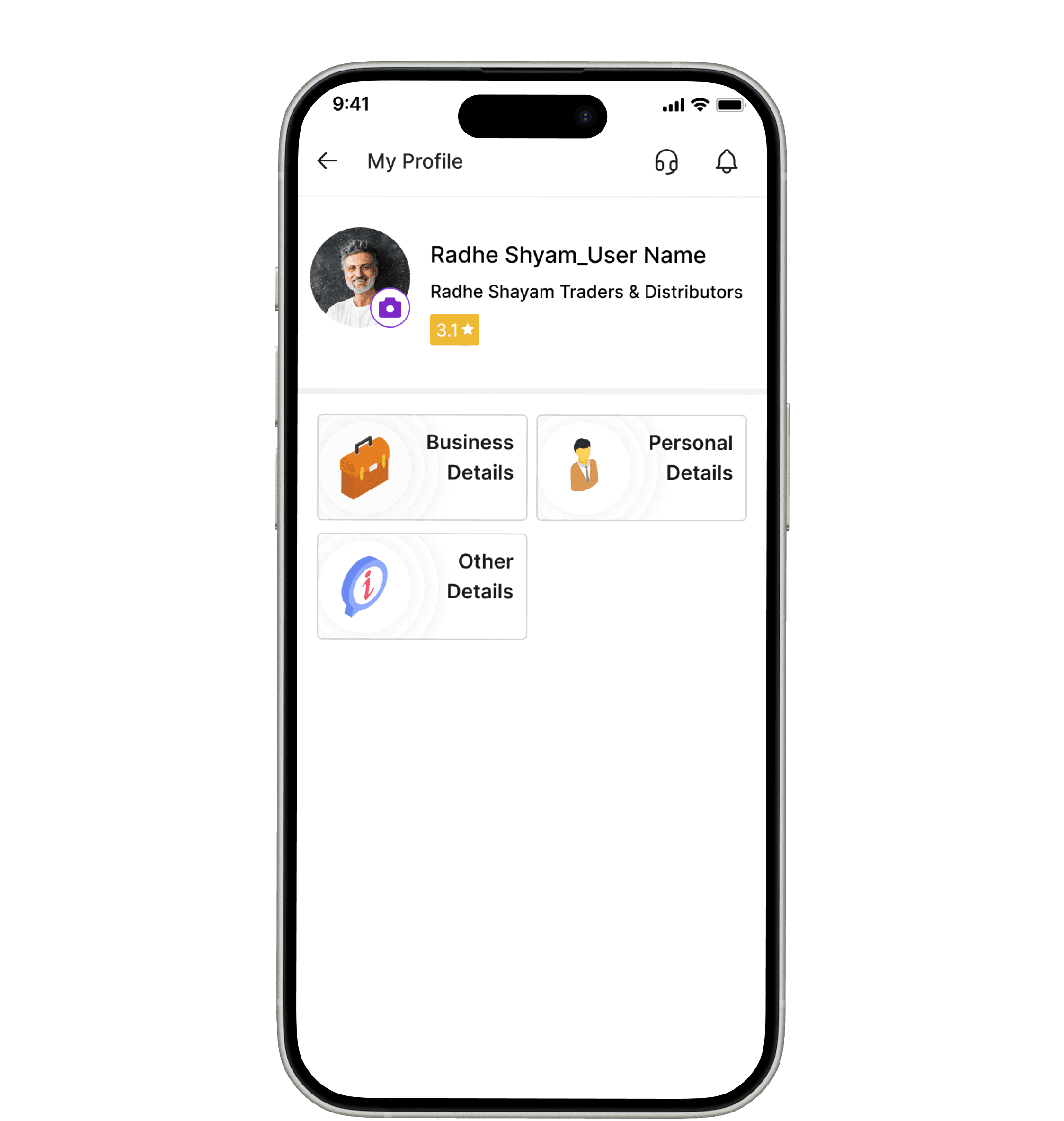
This profile was the MVP & a lot could be improved
40–50% blank
Almost no content visible above the fold. Users landing here saw empty space and icons & no data, no sense of progress, no reason to engage further.
No progress indicator
Users had no visibility of how complete their profile was, which fields were missing, or what they stood to gain by completing them.
Buried entry point
Profile was only accessible via the top hamburger menu → Profile. For most kirana owners using the app daily, it was effectively invisible.
Discovery
Turning insights into goals 🎯
Increase Profile views
Improve Profile visibility in app,
Preferably accessible from Home screen
More Shop photos &
Shop Related data submission
To understand their shop type, shop products
& better identify their user persona.
Discovery & strategy
We found two barriers
Project objectives were simple: increase profile views, and drive more shop photos & shop-related data submission so Badho could understand each retailer's shop type and products.
Barrier 1 — Discoverability
Users never visited the profile
The profile lived behind a hamburger menu → side drawer. Users who opened the app daily to browse and order had no reason and no easy path to their profile screen.
✕ Old entry point: ☰ Menu → Side Drawer → Profile
✕ Zero visibility in daily purchase flow
Barrier 2 — Lack of purpose & Motivation
Users who did visit had no reason to
complete profile
The old profile showed no progress, no benefit, and no indication of what was missing. For busy, time-constrained retailers, completing a profile felt pointless.
✕ No profile completion progress visible
✕ No value communication for submitting data
Design Hypothesis
Make the profile visible everywhere, then give users a reason to engage with it
The profile lived behind a hamburger menu → side drawer.
Users who opened the app daily to browse and order had no reason and no easy path to their profile screen.
Move profile to bottom navigation
Value-first copy: show the benefit of each field
Add profile completion progress bar
Gamify with badges + celebratory completion
KYC nudge with clear payoff message
Design explorations
From insights to iterations
Two rounds of design critique shaped the direction — each round surfaced feedback that fed directly into the next iteration.


Final design
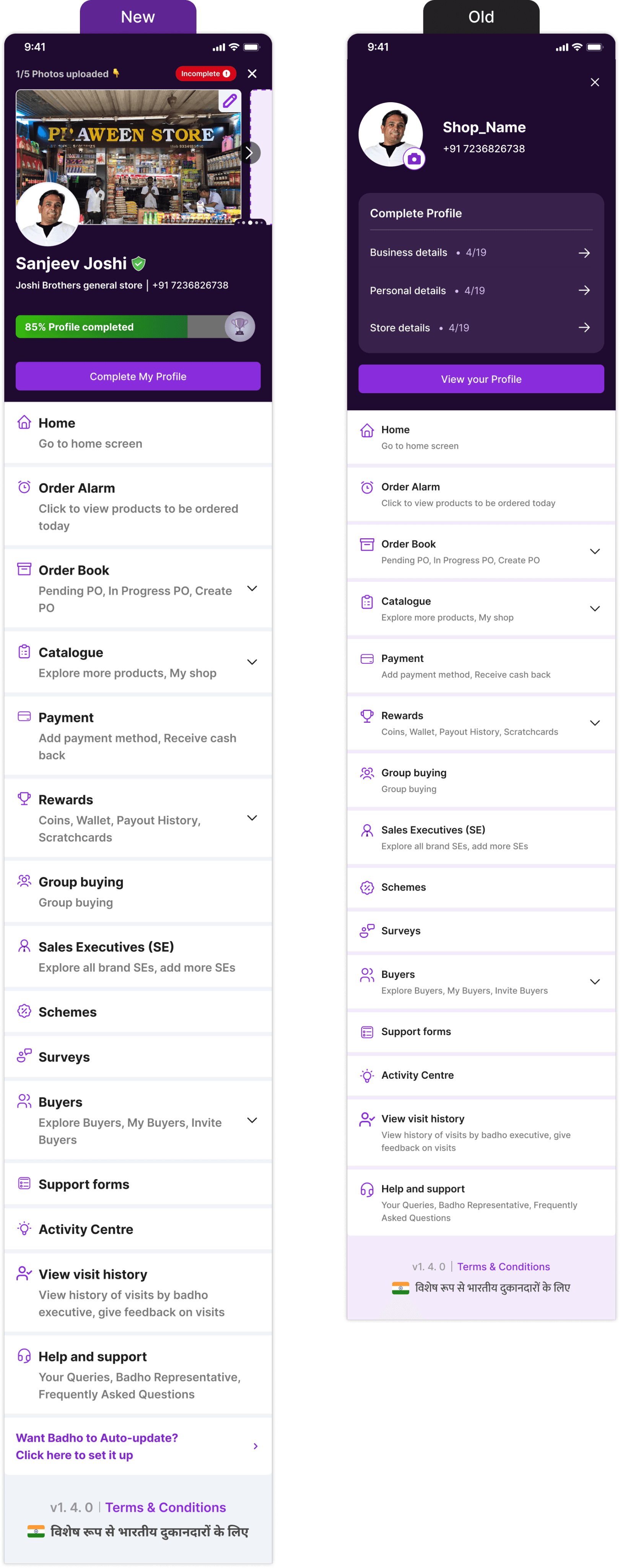
Old vs. New design
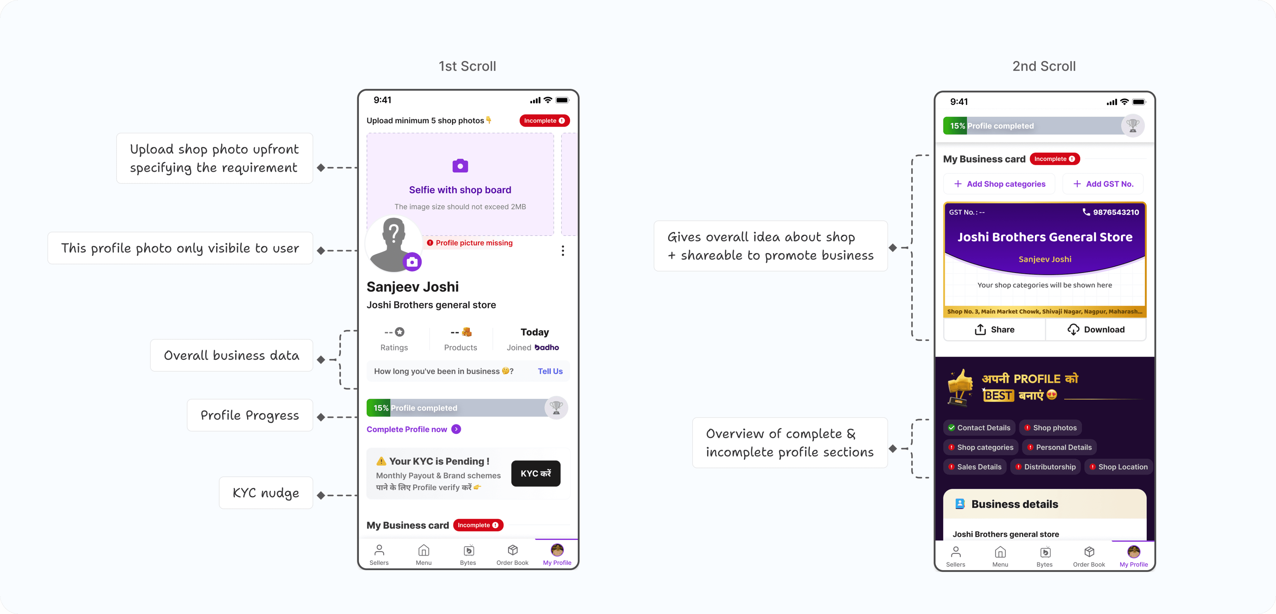
The final design replaced 40% blank space with an upfront shop-photo prompt, a profile progress bar with a clear CTA, and high-emphasis KYC handling.

Profile screen, scroll by scroll
The first scroll leads with shop photos and progress; the second scroll gives a shareable business card and a full section overview.
Designing for every state
New user, partially complete + KYC pending, and fully complete + verified — each state needed its own emphasis and CTA.

Another big change
Entry point to profile
The side drawer got updated to let users directly upload shop photos and see a profile progress bar — and the bottom navigation itself changed.

Trade-off: Prioritizing discoverability
over familiarity
Navigation analytics showed Order Now had consistently low engagement — the best candidate for replacement.
We moved Profile into the bottom nav even though users were already familiar with the previous layout, accepting short-term learnability friction for long-term visibility.
We prioritized profile discoverability over existing habits because richer retailer profiles directly supported KYC, customer segmentation, and future brand initiatives.
Impact / outcome
Impact after launch
Data comparison: 2 months before vs. 2 months after release. Released to production on 28 July 2025.
+5,764%
MY PROFILE VIEWS
+1,078%
PROFILE PHOTOS SUBMITTED
+3,000
SHOP PHOTOS SUBMITTED
+224%
KYC SUBMISSIONS
Reflection
My learnings
✦
Value communication is a multiplier
Showing users why their profile data benefits them (better schemes, brand offers) was more effective than nudges alone. Users filled fields when they understood the payoff.
✦
Profile completion unlocked a new B2B revenue stream
Rich store data enabled FMCG brands to identify and target specific retailer profiles — creating a new partnership and advertising channel for Badho.
✦
Profile can be a data gold mine
The more detailed the user segmentation, the better we understand their preferences, environment, and goals. This data is a gold mine for detailed persona analysis.
Improvement areas
Event tracking
Important to set up tracking for business card share & downloads to measure adoption.
New section design
When a new section was added to the profile later, we saw noticeably lower submission than existing sections.
Deeper journey analysis
Which sections most users didn't fill, and why. We saw more submissions of photos than text inputs.
😊
Thank You for making it all the way !
I'm currently open to Product Design opportunities and always happy to
chat about design, AI, or interesting ideas. See you in my inbox!